3 Key Takeaways from Recent Rebrands
If your company stays in business long enough, you eventually will need to go through a rebranding process.
It’s only natural. Your brand is the outward appearance of your company and any number of factors can cause the need for a rebrand.
Here are 3 examples of recent rebrands and the key takeaways for companies going through their own rebranding process.
Mastercard: Keep It Simple Sweetheart

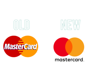
In 2016, Mastercard changed their logo for the first time in 20 years! During that time, Mastercard’s brand had started to become tired and stale.
Branding, and design in general, are similar to fashion in that what’s popular is always evolving and in flux. When a business uses the same branding for extended periods of time, their brand starts to look out of touch much like someone today would if they wore parachute pants and a leisure suit.
Mastercard decided to give their brand a once-over, and it worked out stellarly.
The major changes included simplifying their logo through flat design, getting rid of the comb effect in the center, and putting the word mark on the outside of the graphic. The font for the wordmark changed to all lowercase and wonderfully works in conjunction with the circular shape of the logo. They were able to do all this while still keeping the logo immediately recognizable as part of the Mastercard brand.
They have effectively updated their logo by making it simpler; It is essentially just two primary colors and two basic geometric shapes. The two circles are recognizable enough to work well on their own without the word mark and transfer well on mobile, where almost everyone carries out their banking these days.
So what’s the lesson to learn here?
A rebrand doesn’t need to be overly complex to be great. Small, intelligent changes can often go much further than grandiose ones.
Instagram: Be Prepared for Backlash

In May 2016, Instagram unveiled that its rebrand which involved a new logo and a new user interface.
The new logo is a simple and reductive version of its previous one. The new logo is minimalist and uses a flat, gradient color scheme to represent a smart phone’s camera whereas the old logo featured semi-flat design and multiple colors and textures.
The new logo’s simple yet recognizable design and bright colors helps it to stand out in the sea of other app icons.
The new user interface mirrors the new logo and, according to their blog, was meant to “put more focus on your photos and videos without changing how you navigate the app.”
As is often the case with changes to social media platforms, the changes to Instagram’s logo and UI were not embraced by all of its users.
Instagram met this by interacting with the public and explaining why they chose to update their brand as they did. Eventually, the initial uproar died down and had little lasting impact on Instagram.
This is the first takeaway: don’t overreact to initial negative reaction following a rebrand. You should anticipate the negative feedback and plan on how you will address it upon rollout.
Mozilla: Don’t Be Afraid to Think Outside the Box

Typically, rebranding is a behind-closed-doors process. Most companies prefer to try to work out all the kinks in private and then rollout the rebrand all at once as a finished product.
When Mozilla, the Internet company behind the Firefox browser, decided to rebrand, they went the exact opposite route and were extremely transparent throughout the entirety of the process.
During the five month rebranding process mozilla shared every step of the process on their blog which welcomed the public to interact and influence their rebrand. The ended up reviewing over 3,000 comments from their audience and took their opinions into consideration.
Mozilla’s new logo is reminiscent of a URL address and their colors are derived from the highlight colors used by Firefox and other web browsers.
Mozilla decided to not settle on just one icon or image because they believed it did not reflect the diversity and richness of the Internet. Mozilla may be one of the first to implement open design in their branding material.

If you are planning a rebrand, it can be useful to look to these larger companies to see how they interacted with the public throughout their rebrand process.
TL;DR: Your 3 Takeaways
1. Evolve your brand as a way to adapt and meet the current needs of your business.
2. People aren’t alway welcoming to change. If people are not as accepting to your rebrand, don’t fight fire with fire. Anticipate some negative feedback.
3. Consider doing things differently. By keeping their audience updated throughout the entire process, Mozilla made rebranding a great marketing tool that strongly engaged their customer base.


