Our Best 404 Pages
What is a 404 error page?
A 404 page is also known as an “error page” or a “Page Not Found” page. This page indicates to the user that they have reached the domain they requested, but the URL path doesn’t have any information to provide. Users usually only find this page if they have clicked on a broken link or have mistyped the URL.
The 404 page is perhaps the most neglected web design element. However, our team at Ruby Porter Marketing and Design always put user experience at the forefront. We view the 404 page as a great opportunity to inject personality and fun into the user’s web experience.
A well designed 404 page should do the following:
- Tells visitors clearly that the page they are looking for can not be found. We use language that is friendly, inviting, and playful.
- Maintain design consistency with the rest of the site. We always use the same color, typography and image styles that are used on the rest of the website to maintain branding. We always include the logo, header, and footer to help users recognize the site.
- Keep it simple. 404 error pages should be a one-screen design that does not require scrolling. Less is more when it comes to error pages.
- Be creative and funny. 404 pages can be a page to turn a negative situation into a delightful experience by easing the frustration of a bad or broken link. They are a great opportunity to inject humor and a playful spirit into your website.
Here are a few examples of our best 404 pages:
- One the Line Guide Service – a fishing guide service

2. Memento Ink – a tattoo studio

3. Pacific Plumbing and Rooter – a plumbing service

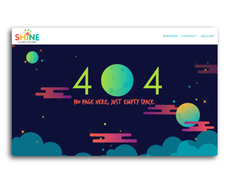
4. Shine – a salon for kids

5. Timothy Joseph Classic – An annual benefit golf tournament

6. Partnered Solutions IT – a managed IT service provider

7. Ruby Porter Marketing and Design – hey, that’s us! Can you find our 404 page?


