Three Principles That Actually Lead to Conversions
The main point of having good website design is to get conversions. A conversion is when your website viewer does your desired action. Getting viewers to actually take action can be difficult but following these three principles will lead to higher conversions.
Attention
People get overwhelmed with too many options. Have you ever asked your S.O. where they want to go to dinner and you get a complacent reply of “I don’t know”. (I know I am guilty of this!) Try narrowing down your options! “Do you want to go to that awesome Thai spot we love or do you want to check out that new burger joint that just opened up?” You will get a direct answer in return. Thai food, please!
The same goes for your website design. You have to help guide your viewers to answer your questions or take action on what you would like them to do. The best way to do this is through attention ratio.
Attention Ratio is the ratio of the number of things you can do on a given page to the number of things you should do. When starting a marketing campaign, you should have a single goal in mind. Whether your goal is selling more of a specific product, having people sign up for your new online class, or calling the office to get a quote your attention ratio should be 1:1.

The example on the left has an attention ratio of 14:1 the example on the right has an attention ratio of 1:1.
Clarity
Clarity is important for conversions. If you make your visitors strain and work to find out what it is you have to offer and what makes you unique, they will be clicking the back button and not the Call to Action button.
When we meet with you to discuss your website’s needs one of our first questions is “What is your company’s unique value proposition?” This means, what distinguishes you from your competition, what benefits do you offer your customers, and how do you solve your customer’s needs? It is your homepage’s primary job is to communicate your Unique Value Proposition in the clearest way.
Your website should be so clear that within the first five seconds users know what your business is and what is that you are offering.
Clear vs. Clever
In the age of shiny object syndrome, marketers often get sucked into trying to be cute and clever in their writing. While this can hold your attention for a second, if your headline doesn’t clearly state what you do or what you have to offer, people probably won’t read further. 80% of people will read your headline, but only 20% of people will read further.
A lot of marketers get stuck using buzzwords and jargon to grab attention. How many times have you read headlines claiming their product is “cutting-edge”, “forward-thinking”, or even “life-changing” or that their services will “raise the bar”, “give 110%’, or “push the envelope”.
Using cliches and buzzwords can harm your credibility and make your message less effective. If you are worried that your website uses jargonistic and wishy-washy wording this Chrome extension will highlight your offending phrases and give cheeky and constructive advice. Or better yet, use Ruby Porter’s experienced copy writers to create persuasive, clear, and engaging content for your website.
This doesn’t mean that you have to sacrifice your voice in order to be clear. Clear doesn’t have to be uninteresting, unimaginative, or lazy.
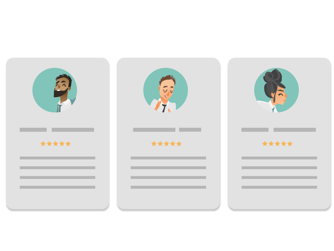
Credibility

Your webpage design should help you come off as trustworthy and credible as possible. One way to do this is through social proof.
We trust what is endorsed by crowds. Take restaurants for example. When you walk by an empty restaurant you conclude that the food must not be good. When you walk by a restaurant with a line out the door, you assume that this option is the tastier of the two. You may even eagerly put your name on the wait-list. Your website works in the same way.
There are many different ways to build trust on your website.
- Rankings
- Testimonials
- Endorsements
- Ratings and Reviews
- Badges, Seals, Certifications, and Awards
- Social Shares
Creating a website that persuades users to to take action can be difficult and overwhelming. Luckily Ruby Porter Marketing Design is able to take care of your website design needs for business in Eugene, Oregon and beyond!
